
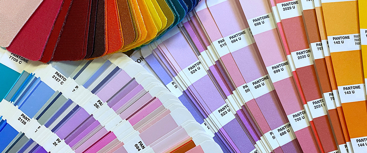
Have you ever wondered why your artwork using a specific red or blue matches across multiple decoration methods? It is because printers use a specialty color matching system produced by the company Pantone. Get ready because the system’s name is really difficult to remember. It is the Pantone Matching System, otherwise known as PMS in the industry. Oof, tough, right? And while fine artists and larger corporations tussle with the idea of copyrighting formulas on color, Pantone has done a fantastic job making sure your logo and art print the same across multiple printers.
Mixing and Matching Colors

With PMS guides, all printers ensure they are mixing the same color. So while you may see a bright sky blue, a printer will see 12.50% Reflective Blue, 12.50% Process Blue, and 75% Transparent White. Not only that, but the PMS system has literally thousands of colors to choose from that printers can match to and most screen printers and off-set printers have honed their eyes to be able to spot the most subtle variations within 1%. When the average human eye has only three cones to discern color, it wouldn’t be surprising to hear that ink mixers and printers usually have the rare 4th cone that only exists in 25% (or less) of the world’s population! Super hero power? Possibly. We aren’t going to argue against the theory.
There are also different mixes used when printing different types of ink bases on different materials. Printers navigate these issues everyday to make sure that color prints accurately for their end user. It can all get very complex, which is why the Pantone ink system has call numbers to easily reference and make it easier for all users to know we’re on the same color page!
Color Matching Limitations on Promotional Products

There is a catch with the PMS matching system. Not all mediums are able to carry every single pantone ink color. For instance, thread and vinyl have a limited palette in comparison to the thousands of color options when mixing ink. When this happens, printers and designers have to find the next best thing, or the closest color match possible. We still use the PMS color cards to figure out which color that might be, but some colors will have a slight variation from their originals.
For many of these applications, it isn’t that big of a deal because color perception changes based of lighting environment and material. This variance is considered standard in promotional products and embroidery.
How to ensure your Colors remain consistent

So let’s say you want to make your logo perfectly match across all promotional, embroidery and screen printed products. How do you make sure the colors in your logo and your artwork are easily matched across multiple mediums? Keep your colors simple! If you pull up your PMS color and it is something the the 1000s, or the 7000s, chances are you won’t be able to find a colored frisbee in that color. But if you choose a color in the system that is lower, it means that Pantone has had the ink mixture around longer. And this gives the promotional marketing, and the printing industry time to adjust and offer it as a color.
Above, there are three different colors for gold. PMS136 is a standard option across most printing and promotional products. PMS1365 is a slight variation that we can once print as well. But PMS 7409 is a newer color that we would be able to mix in for, you won’t find a promotional product that matches this color.
Do you also notice how vibrant and BRIGHT 136 and 1365 are in comparison to 7409? That’s because the higher the number the more mixed and nuanced the ink color. These colors are great when creating artwork and illustrations. But they can bog down your logo’s silhouette because they could lack the contract necessary for consistent brand recognition. So beware using a higher color number, especially if you want to incorporate more than one color in your logo.


